
From Digital to Print: Scaling Finqware’s Brand Design
YEAR
2021-PRESENT
AGENCY
Freelance
CLIENT
Finqware
DELIVERABLES
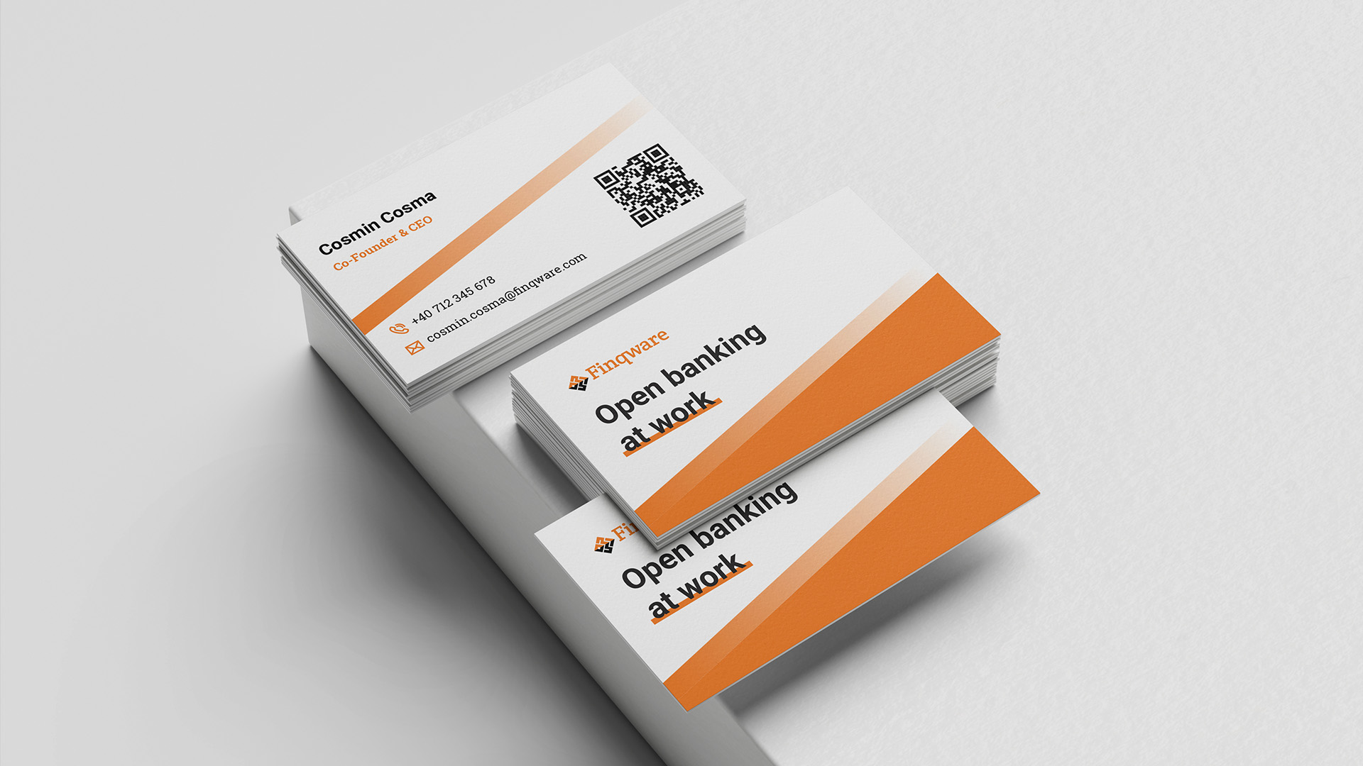
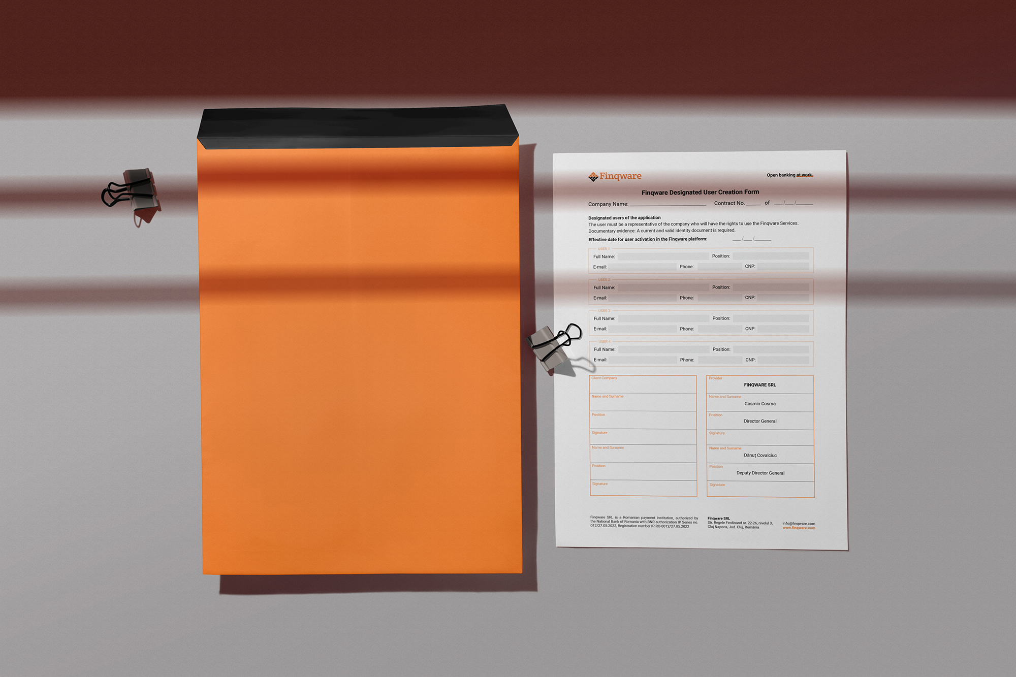
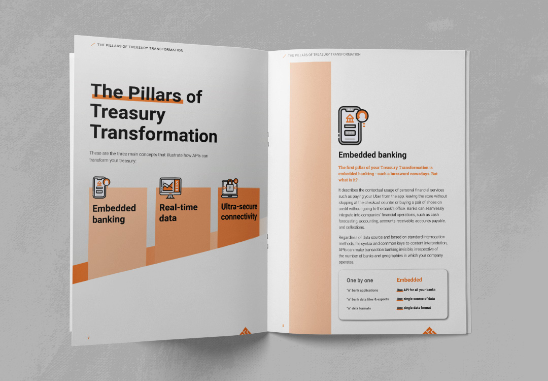
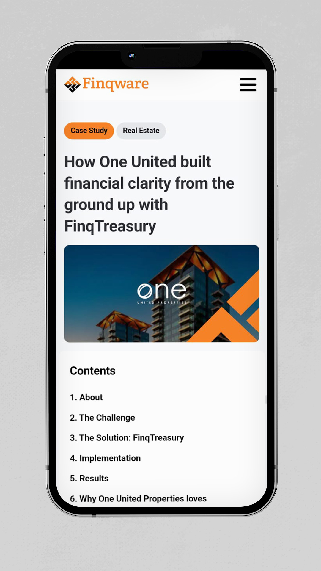
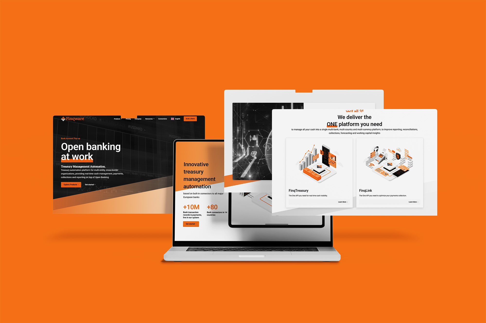
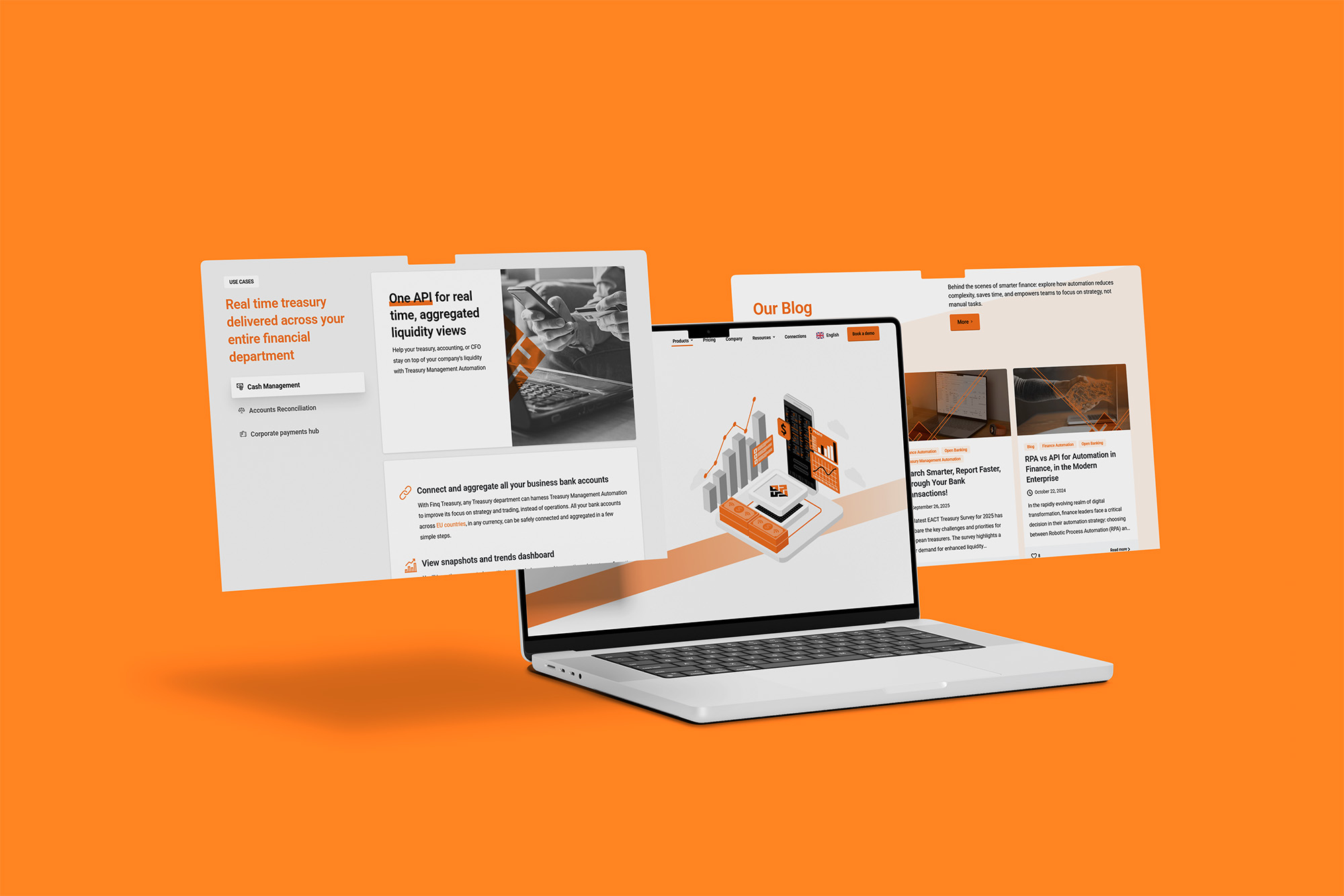
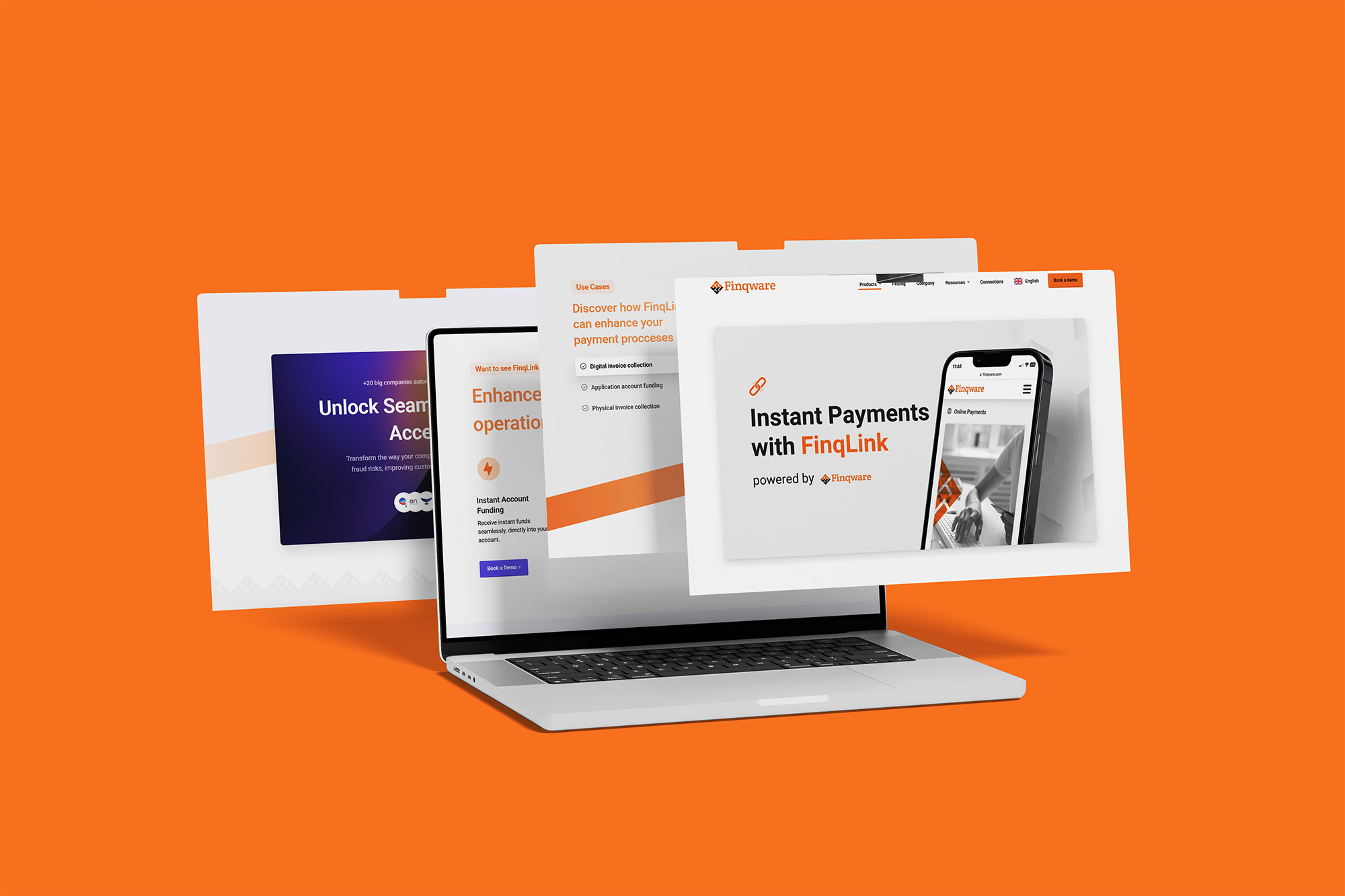
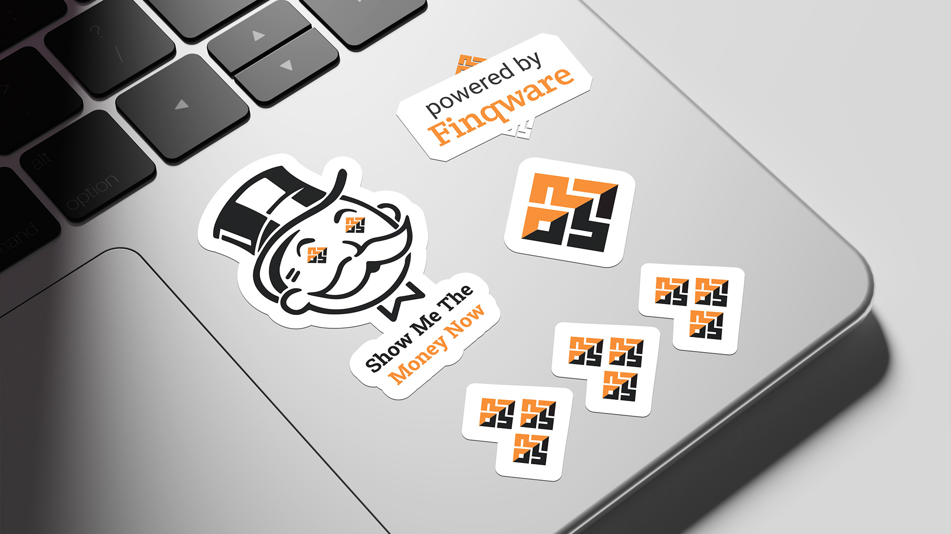
web design, presentation design, pitch-deck design, business cards design, sticker design, whitepaper design, contract form design, case study design, apparel design, digital ads design, social media posts design

Context
Finqware is a European fintech company building real-time financial data infrastructure for enterprises. They already had a logo and a brand manual when we started working together, but needed support with materials on a monthly basis.
Challenge
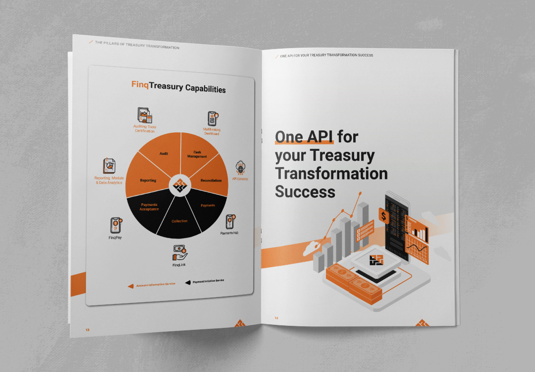
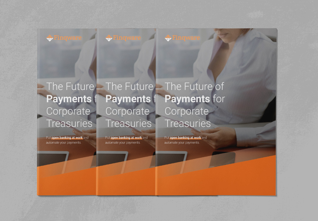
Finqware needed design not for a campaign or for a rebrand, but as an ongoing capability. Instead of outsourcing fragmented assets to multiple providers, the company needed a consistent visual foundation applied everywhere — from presentation decks to employee swag. The challenge was to build a system that could handle a high variety of deliverables while remaining recognisably Finqware.



System
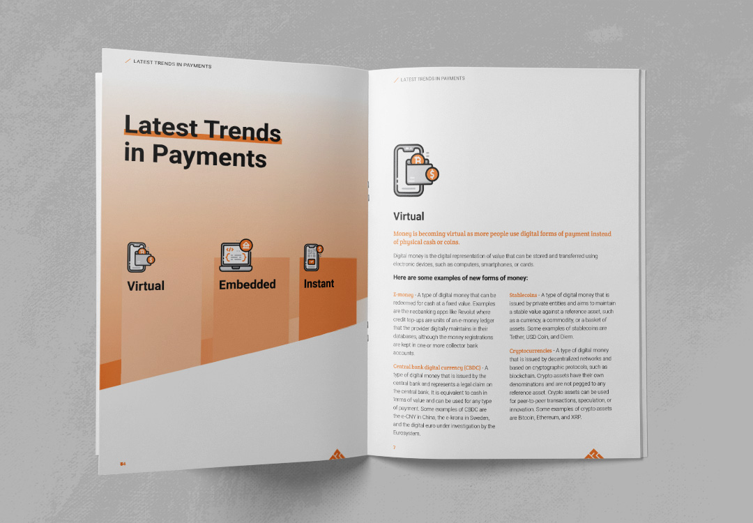
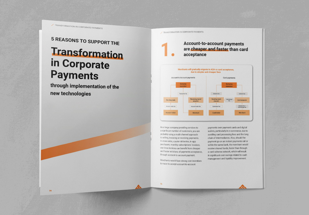
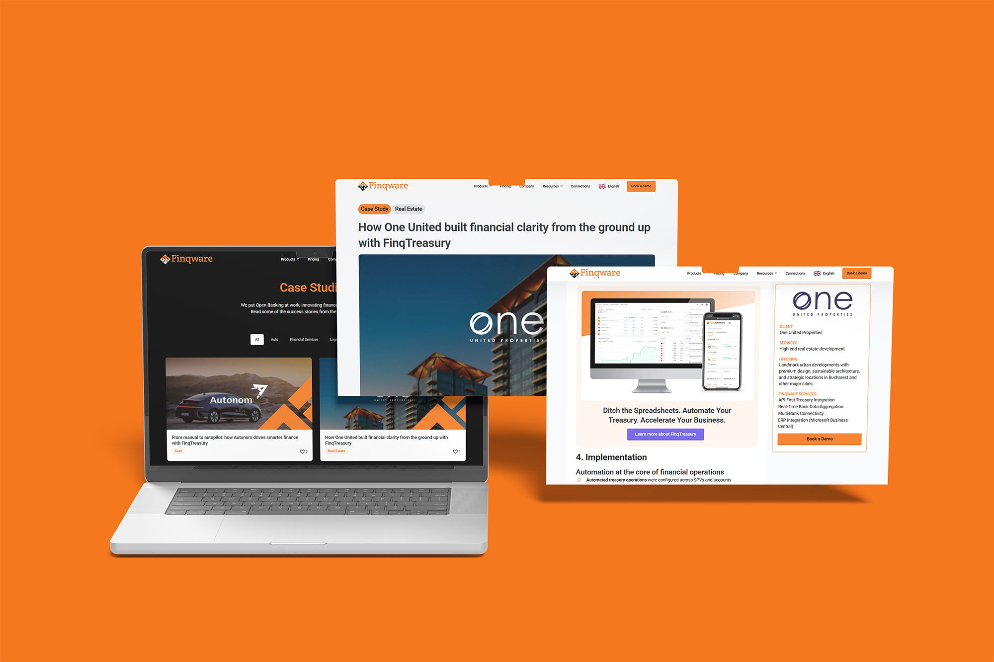
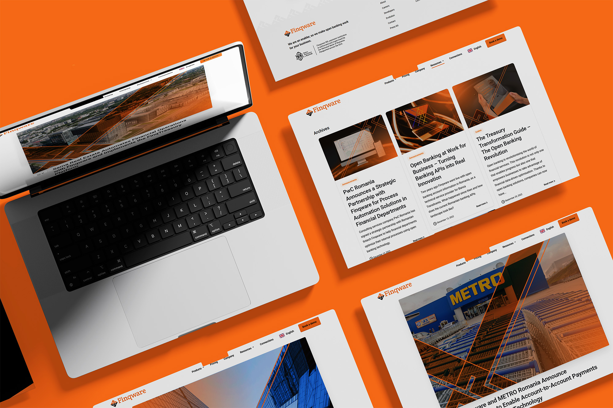
The first step was not producing deliverables, but creating a visual framework. Rules for grids, typography, iconography, tone of imagery, and brand colour handling were defined. This “invisible architecture” became the anchor. Every new design request, whether for a landing page, a whitepaper, a blog post or a social media ad, is plugged into this system.




Workflow
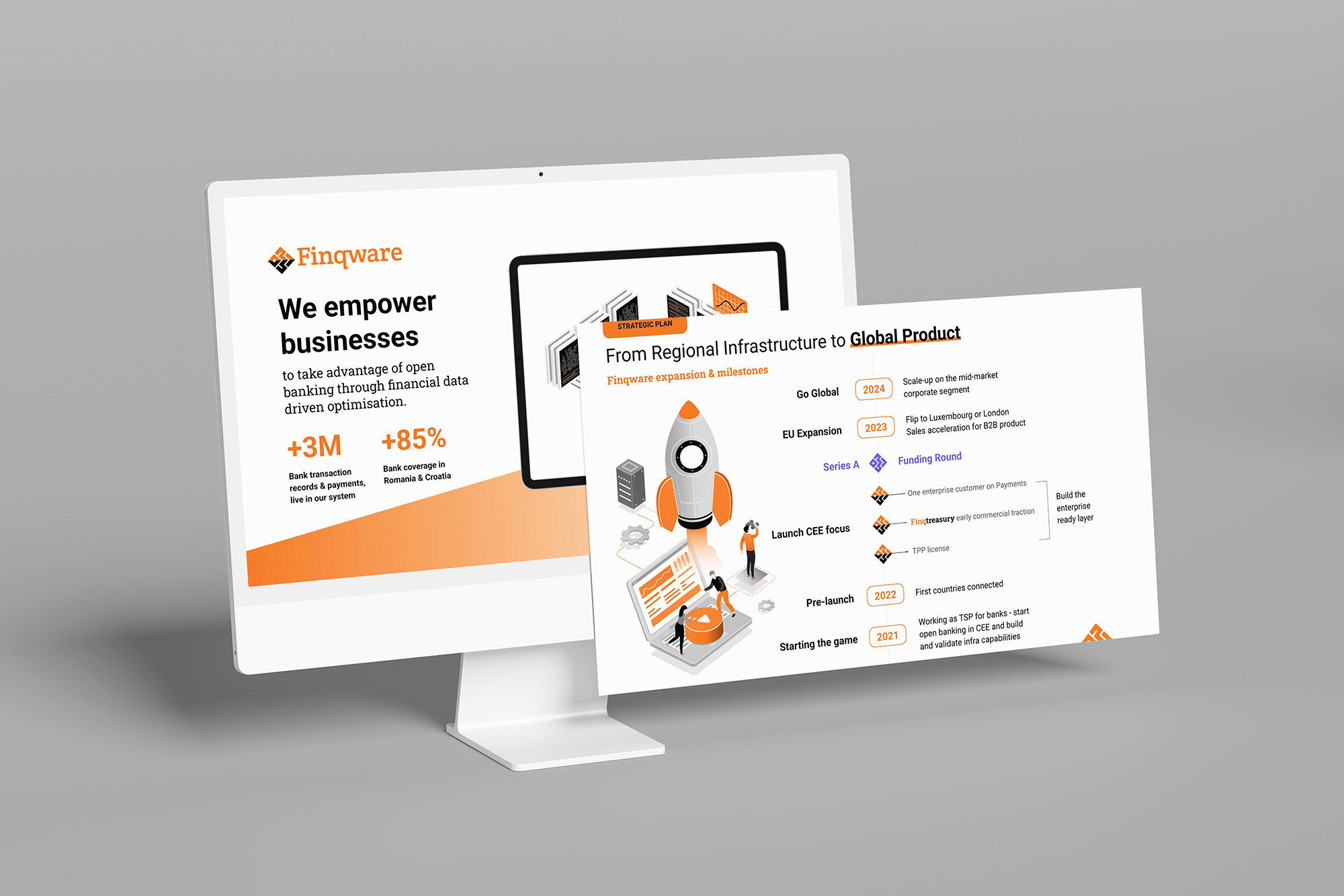
Every month, deliverables are prioritised and designed as modules of the system. A contract template aligns with the same grid that guides a pitch deck. Stickers share the colour ratios of web banners. Internal documents adhere to the same typographic style as investor-facing presentations.
Evolution
Since 2021, I have expanded the Finqware brand design across:
-
Print (contracts, whitepapers, business cards, swag).
-
Digital (websites, decks, ads, social visuals).
-
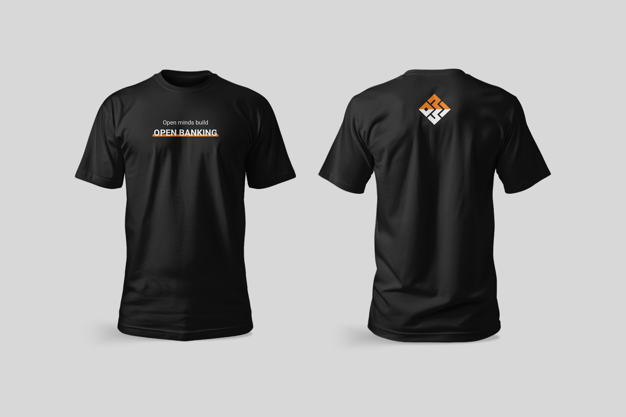
Internal culture (apparel, event kits, diplomas).
Because of the design system, growth is cumulative, not fragmented. Each new piece strengthens brand visual recognition.

Explore More Work
VitaMax D3 Vitamin
Floriol Cold Pressed Oil